NIH-Funded Project Collaborations Across Big Ten Universities in 2024
Submission for Data Visualization Competition 2026
About This Visualization
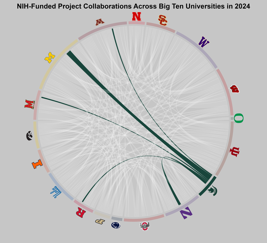
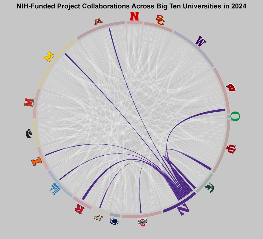
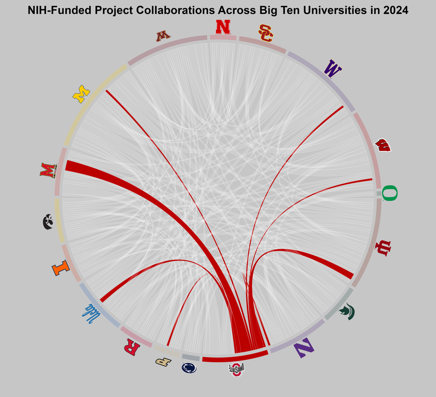
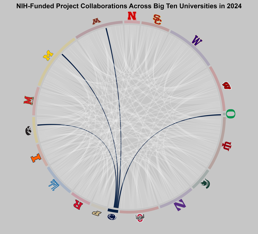
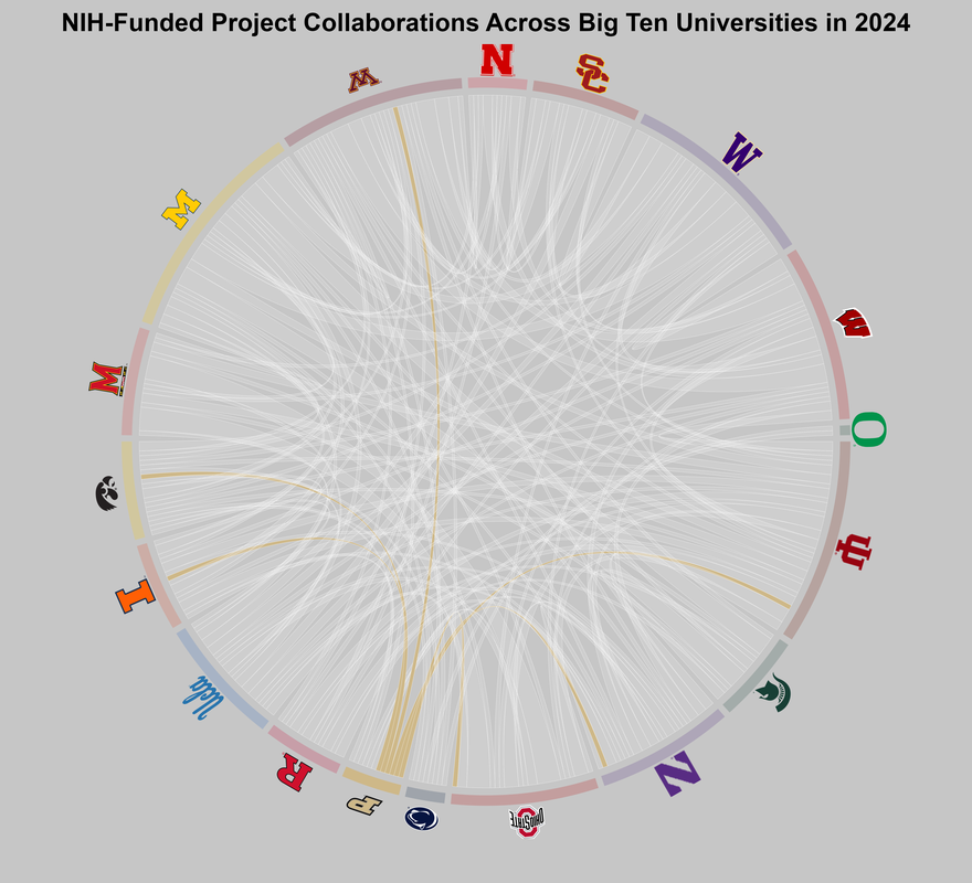
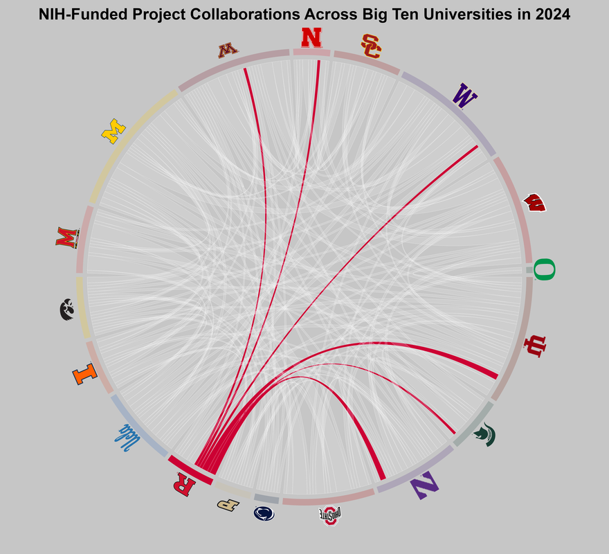
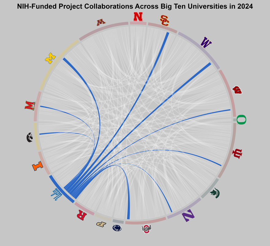
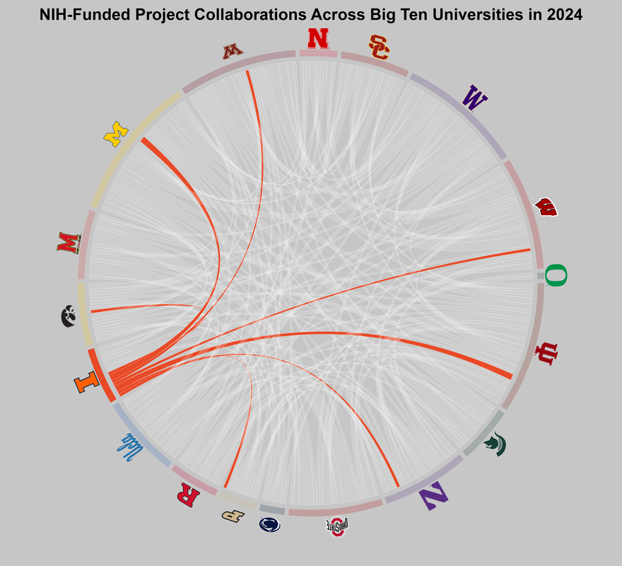
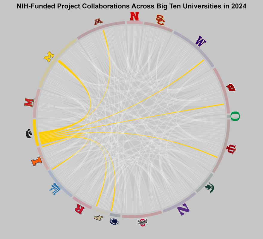
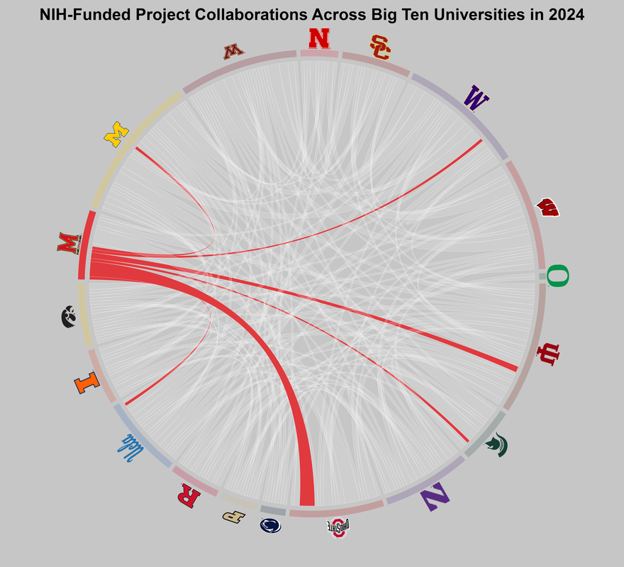
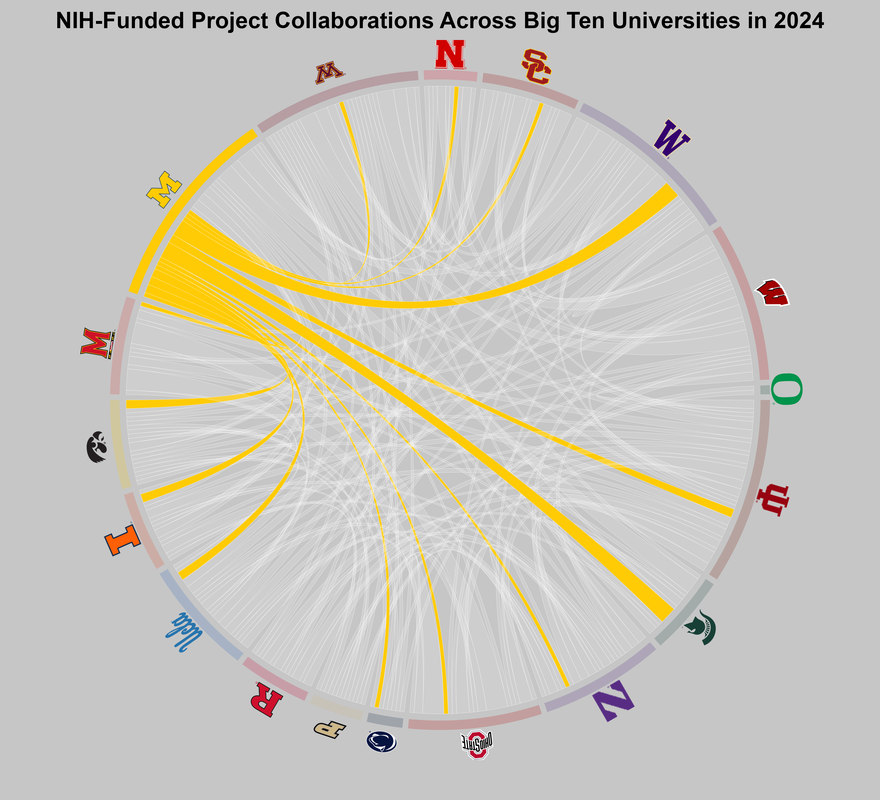
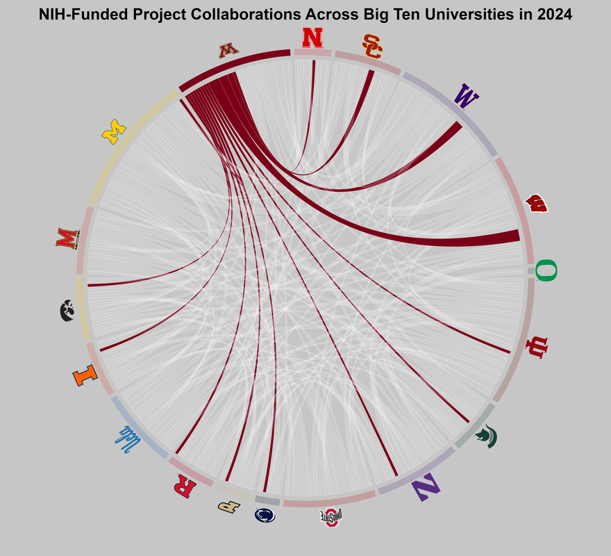
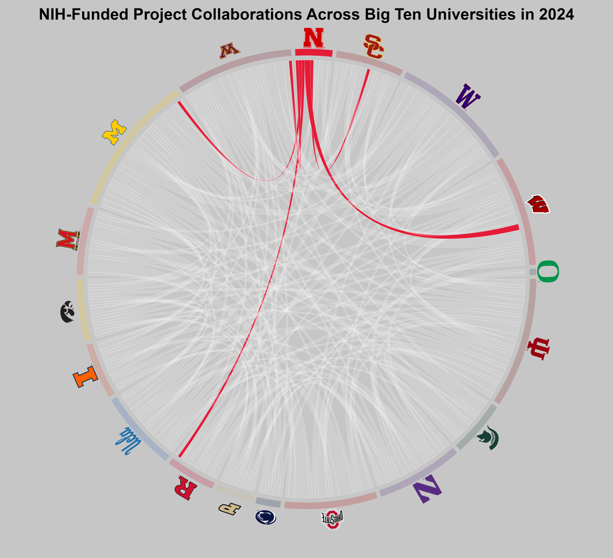
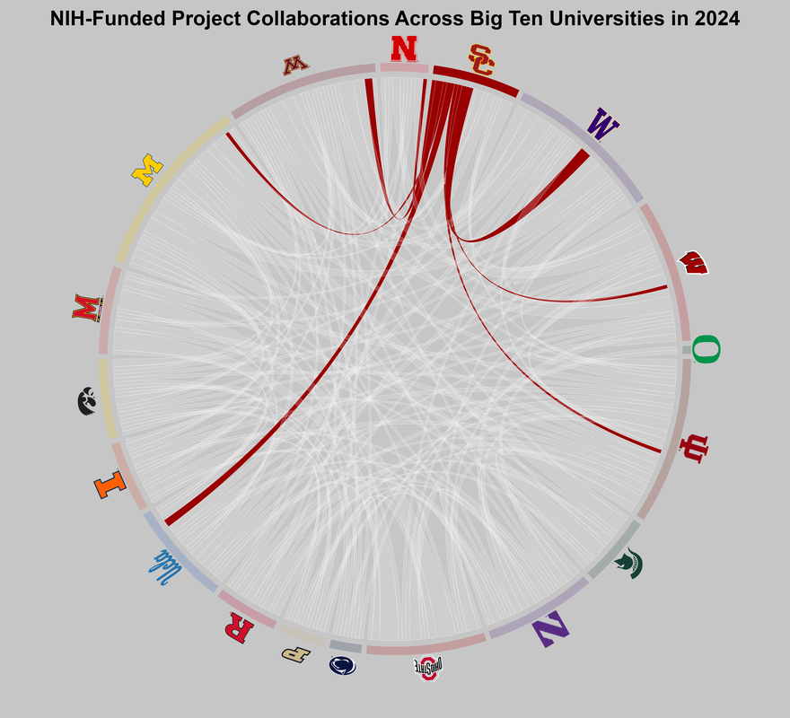
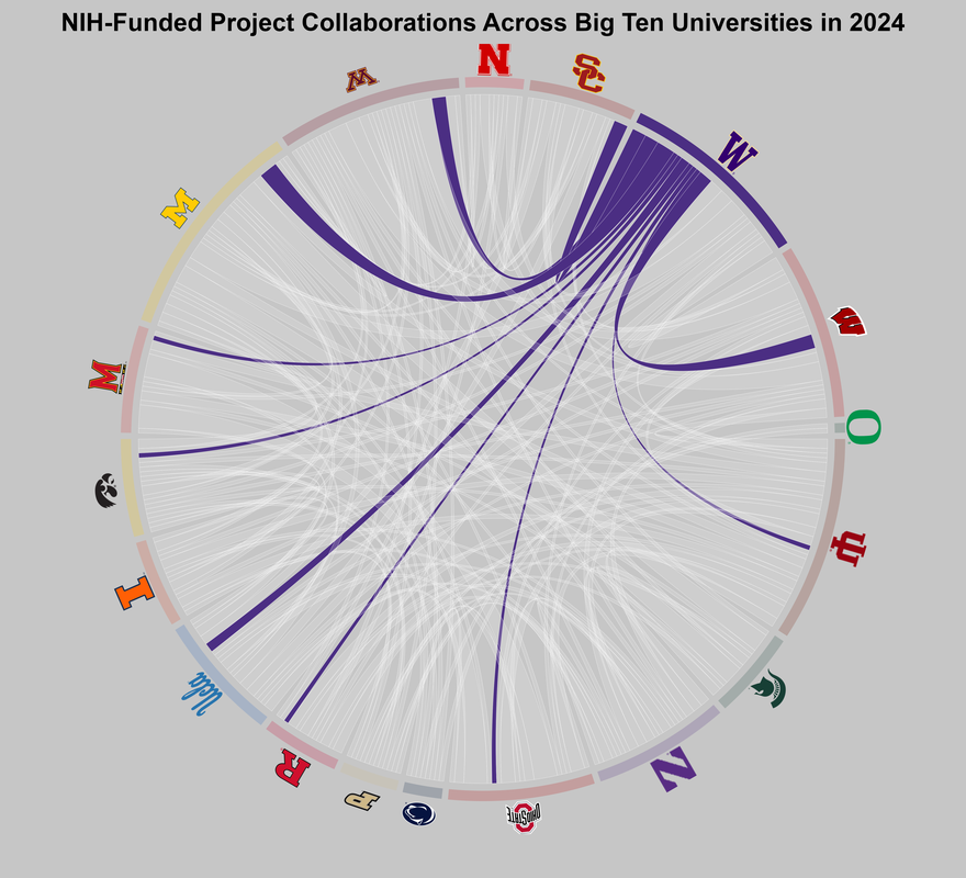
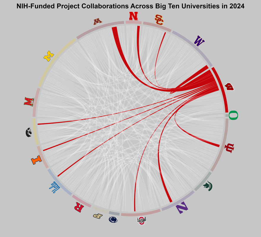
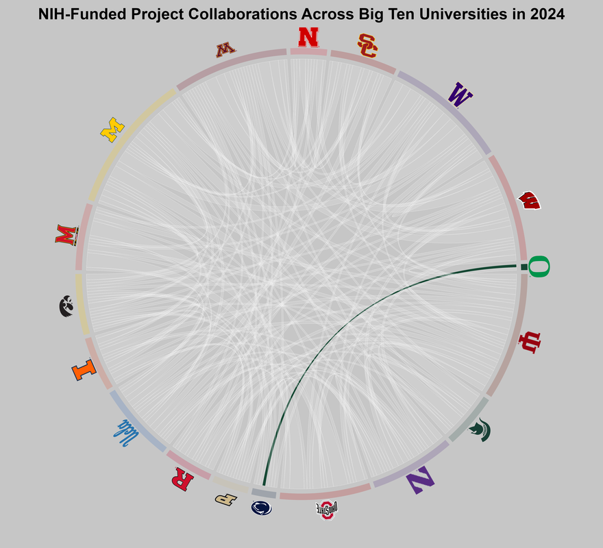
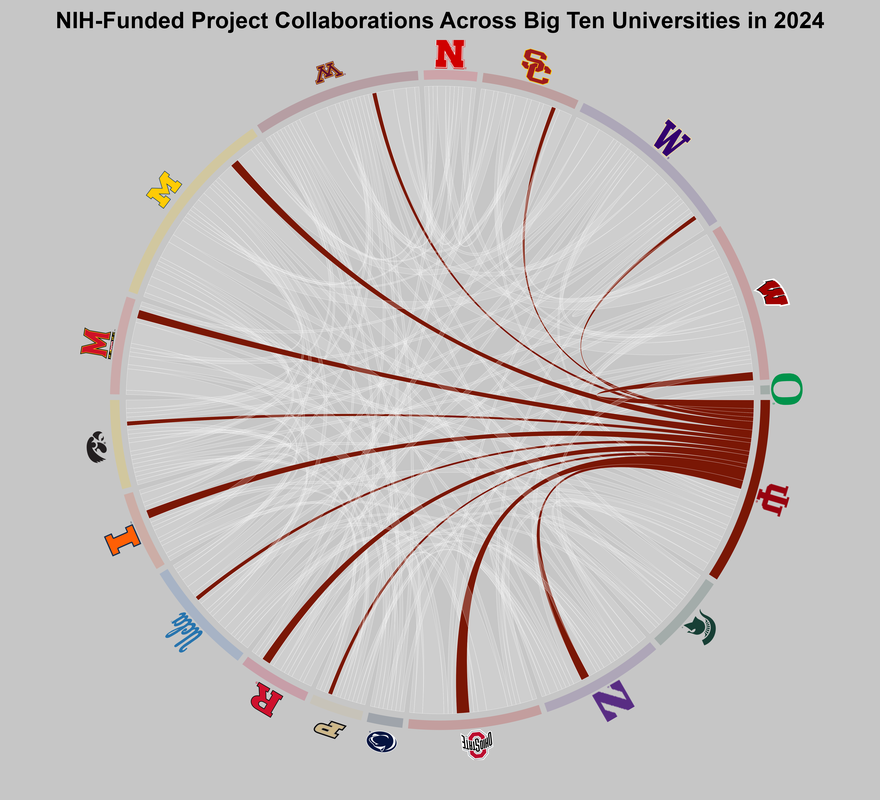
As someone who is working on a NIH funded project, it has shown me the value of collaboration and dedication. I wanted to create a visualization that highlights the effort and strong partnerships that drive research forward. This visualization explores collaborations among universities on NIH‑funded projects using a chord diagram. Each ribbon connects two specific universities and its thickness reflects the number of shared projects, making collaboration strength and network structure visible at a glance.
The diagram is styled from a focal university’s perspective: darker ribbons highlight that university’s collaborations, while lighter ribbons show the same links from other universities’ perspectives to provide context without overwhelming the figure. Because these lighter ribbons duplicate existing connections, arc length should be read as a visual cue of involvement, not a total number of collaborations.
Data was sourced from NIH RePORTER and cleaned to include only Big Ten institutions. University names were normalized so that variations were grouped under a single standardized label. Collaborations were identified when the same Principal Investigator (PI) ID appeared across more than one university, representing shared involvement in NIH‑funded projects spanning multiple institutions. To emphasize each institution’s role within the broader network, using R to generate separate chord diagrams and combining them into a single animated GIF using Adobe tools.
Animated Overview
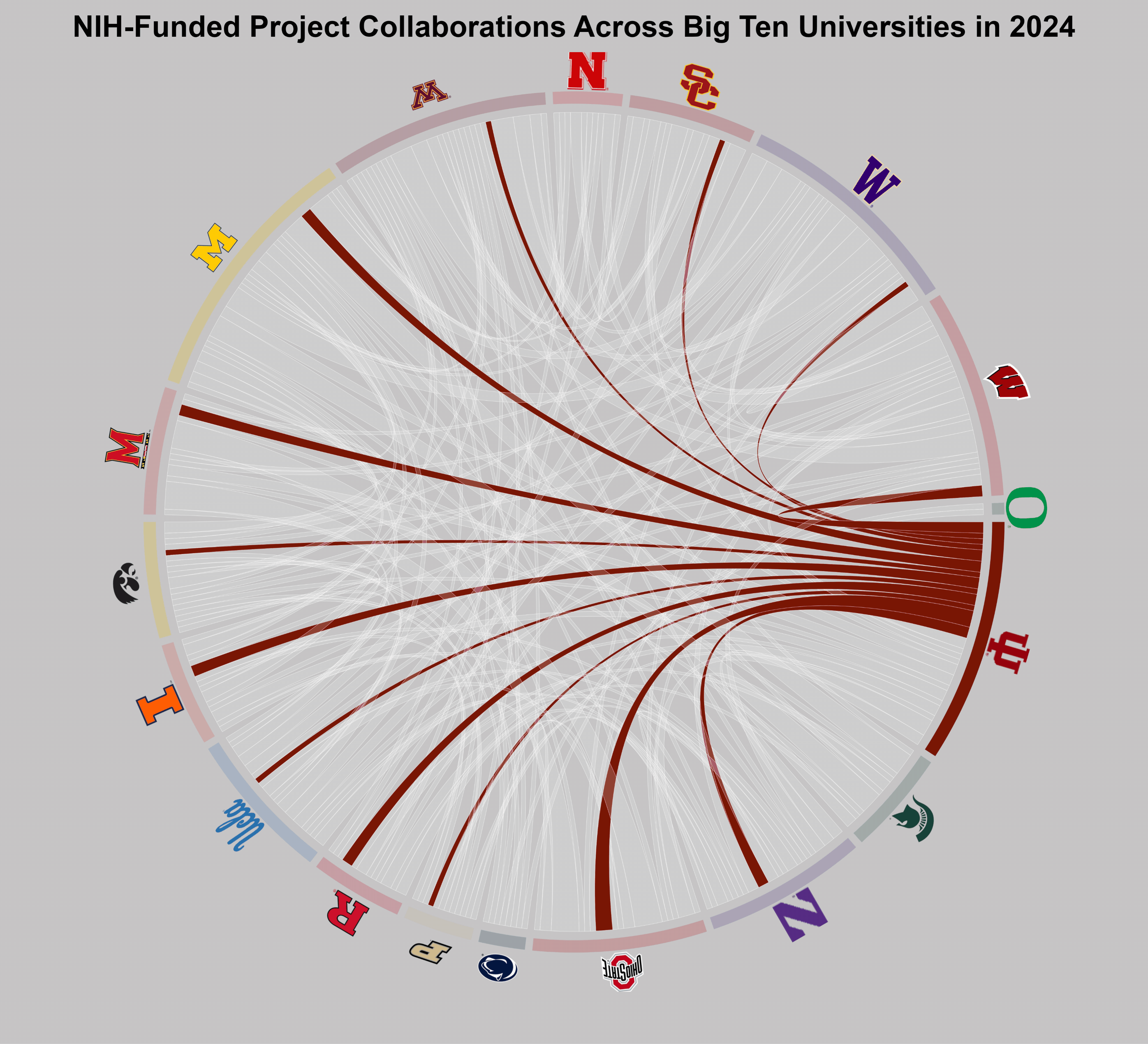
Individual Views